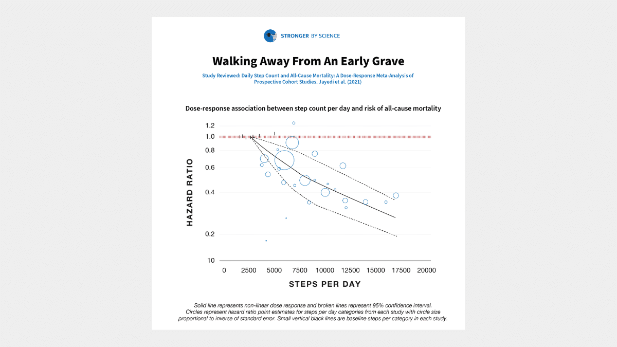
A 2021 meta-analysis sought to determine the relationship between daily step counts and all-cause mortality. The researchers started by scouring several databases to find all of the prospective cohort studies that quantified the relationship between step counts and all-cause mortality rate. From there, they extracted all of the relevant data, performed a pretty standard random-effects meta-analysis, tested for moderating variables, and assessed the certainty of their conclusions using the GRADE criteria.
Seven studies were included in the meta-analysis, accounting for 28,141 total participants, 175,370 person-years, and 2,310 deaths. The researchers found that rates of all-cause mortality were about 12% lower per 1,000 steps per day (hazard ratio = 0.88; 95% CI = 0.83-0.93). The potential moderators examined (studies with longer versus shorter observation periods, studies from Europe versus the US versus Asia, studies with older versus younger participants, etc.) didn’t impact the findings to any meaningful degree – the hazard ratio fell within the range of 0.81-0.93 for all subgroups of studies tested. According to the GRADE criteria, we can have a high degree of certainty in the relationship between step counts and all-cause mortality. Comparing the lowest step counts to the highest step counts reported in the studies included in this meta-analysis, walking 16,000 steps per day was associated with a 66% reduction in all-cause mortality compared to walking just 2,700 steps per day. Stated conversely, walking 2,700 steps per day was associated with a three-fold greater risk of all-cause mortality than walking 16,000 steps per day.
Before interpreting these results, I want to make one thing crystal clear: I’m not falling into the trap of assuming that correlation implies causation. It’s entirely possible that people who are healthier simply tend to walk more than people who are less healthy, and daily step counts are therefore merely a proxy for general health, and don’t have an inverse causal relationship with all-cause mortality. However, I don’t think that’s the case – at least not entirely. For example, a 2015 meta-analysis found that group-based walking interventions, all lasting one year or less, led to significant decreases in systolic blood pressure, diastolic blood pressure, resting heart rate, body fat percentage, body mass index, total cholesterol, and depression scores, while increasing VO2max, 6-minute walk distance, and score on the SF-36 physical functioning inventory. Most walking intervention studies don’t use particularly strenuous walking programs either – generally 20-30 minutes of walking per day, which works out to ~2,400-3,600 steps for most people. So, if a bit of walking can beneficially modify ten different risk factors for all-cause mortality in less than a year, I think we can make a pretty strong case that the inverse relationship between step counts and all-cause mortality is more than mere association.
I think it’s worth contextualizing how striking these findings are. I’m sure most readers would agree that cigarette smoking isn’t great for longevity. However, smoking seems to be associated with ~70-80% higher rates of all-cause mortality. Relative to people who walk 16,000 steps per day, walking just 2,700 steps per day is associated with ~200% higher rates of all-cause mortality. It’s also not uncommon for people in the fitness industry to discuss the risks associated with obesity, and for good reason. Higher BMIs are associated with greater all-cause mortality risk. However, a BMI of 30 is associated with a ~4% greater all-cause mortality risk than a BMI of 23, and a BMI of 40 is associated with a ~74% greater all-cause mortality risk (Table D, “All participants, all studies”). Thus, you could argue that being very sedentary (relative to being very active, as the standard of comparison) is a larger independent risk factor for all-cause mortality than smoking status or obesity.
I think it’s easy for lifters to fall into the trap of assuming that being in the gym for a few hours per week and maintaining a healthy body composition are sufficient to maximize longevity, despite being relatively sedentary outside of the gym. Dedicated training is great, and building and maintaining muscle mass and strength will probably help you live longer (and maintain your ability to comfortably perform activities of daily living further into your twilight years), but there’s no substitute for simply moving more. Research suggests that adults in the US average ~5,100-6,500 steps per day. The present meta-analysis suggests that getting just 6,000 steps per day is associated with an all-cause mortality risk ~126% higher than the all-cause mortality risk associated with taking 16,000 steps per day. I’m sure that 6,000 steps plus dedicated resistance training is better than 6,000 steps with no resistance training, but it’s difficult to overstate the importance of simply being on your feet and moving a lot.
Before I wrap up, I want to make it clear that I’m not arguing that we should start sedentary-shaming people. If you have an office job, you don’t live in a walkable city, and you have a lot of obligations outside of work, it may be hard to carve out the time to get a lot of steps in. If you live in an unsafe neighborhood, it may be harder to get a lot of steps in. There are plenty of diseases that make it harder (or impossible) to get a lot of steps in. I just want you, as an individual, to be informed – if you want to live a long time, it never hurts to go for a walk.
Update: July 2024
We originally published this article soon after the Jayedi meta-regression was published in 2021. Since then, more research has been done on the topic, and newer meta-analyses have been conducted, largely confirming these findings. The largest and most recent is by Banach and colleagues, including 17 studies with over 225,000 participants. This larger sample size allowed the researchers to split the results out by age and sex, but the same general findings were observed across the board: higher step counts were associated with lower relative risks for all-cause mortality.
Of note, some people have argued that these newer meta-analyses (this meta-analysis by Banach, and a similar meta-analysis by Stens and colleagues) conflict with the Jayedi meta-analysis discussed in the original version of this article. They contend that the Jayedi meta-analysis suggests that there’s a more linear relationship between step counts and all-cause mortality risk, whereas these newer, larger meta-analyses reveal a stronger non-linear relationship, where diminishing returns are observed as step counts increase.
There’s no polite way to say this, but that criticism seems to stem from an inability to understand graphs. The graph from the Jayedi meta-analysis had a log-scaled y-axis, which is common in research analyzing relative risk. It’s a fairly common practice because a reduction in relative risk of 0.1 points implies an increasingly large difference in effect magnitude as relative risk decreases. For example, if your relative risk decreases from 1.0 to 0.9, your relative risk has decreased by 10%. If it decreases from 0.5 to 0.4, it’s decreased by 20%. If it decreases from 0.2 to 0.1, it’s decreased by 50%. Log-scaling visually represents this relationship more clearly. But, a property of log-scaled axes is that they make non-linear relationships appear more linear (to people who don’t know how to read log-scaled graphs). The figure below shows the relationship between step counts and all-cause mortality in the Jayedi meta-analysis with a linear-scaled y-axis (like the Banach and Stens meta-analyses). As you can see, the general relationship between step counts and all-cause mortality in the Jayedi meta-analysis was very similar to the relationship observed in the Banach and Stens meta-analyses – this similarity becomes visually apparent when the Jayedi data is presented on a y-axis with linear scaling.
How you interpret relative risk depends on your baseline point of reference, and I think the log-scaled graphs present the data in a way that’s less likely to be misinterpreted (if you already know how to read log-scaled graphs). To illustrate this point, let’s focus on the male data from the recent Banach meta-analysis.
It certainly appears that returns diminish as step counts increase – the benefits of increasing your step count from 0 to 5000 appear to be much larger than the benefits you get from increasing your step count from 15,000 to 20,000. But, is that really the case? That strongly depends on your point of reference.
For example, let’s assume you currently walk 0 steps per day, and you want to halve your relative risk. Looking at the graph, a relative risk of 0.5 corresponds to about 7,500 steps per day. So, you’d need to increase your step count by about 7,500 steps to halve your relative risk (assuming the relationship between step counts and all-cause mortality is actually causal, of course).
Now, let’s assume you already walk 10,000 steps per day, and you want to halve your relative risk. At first glance, you’d think that this would require a dramatically larger increase in step count than halving the relative risk of someone who’s completely sedentary. But in reality, it only requires a slightly larger increase. A step count of 10,000 steps per day corresponds to a relative risk of 0.4, so to halve your risk, you’d need to get down to a relative risk of 0.2, which corresponds to about 18,500 steps per day. So, you’d need to increase your step count by about 8,500 steps to halve your relative risk. 8,500 is clearly a larger number than 7,500…but not that much larger (and, I suspect, it’s a much smaller difference than most people would intuitively assume when viewing this data presented on a linearly scaled y-axis). However, this all becomes much more apparent and intuitive when the trendline from the Banach meta-analysis is presented on a log-scaled y-axis:
Linear axis scaling (with this type of data) helps you more easily understand risk relative to the universal point of reference selected in the study: whatever step count corresponds to a relative risk of 1.0 (0 steps in the Banach study, and 2700 is the Jayedi study). If you don’t walk at all, you’d need to increase your step count by 7,500 steps to reduce your relative risk by 50%, and 17,500 steps to reduce your relative risk by 75%, which (correctly) implies that there are diminishing returns past a certain point – if you’re completely sedentary, the first 7,500 steps reduce your risk by 50%, and the additional 10,000 steps only reduce your risk by an additional 25%.
However, logarithmic axis scaling (with this type of data) helps you more easily understand risk relative to any given point on the graph. If your current relative risk is 0.4 (which could just as easily be a relative risk of 1.0 since it’s your baseline), the vertical distance between 0.4 and 0.8 (a doubling of your risk) is the same as the vertical distance between 0.4 and 0.2 (a halving of your risk). If you re-scaled the axis to make 0.4 the point of reference (rescaling the axes so that a relative risk of 0.4 is now a relative risk of 1.0), the same properties would apply – the vertical distance between 1 and 2 (a doubling of your risk) would be the same as the vertical distance between 1 and 0.5 (a halving of your risk). So, once you get comfortable with reading and interpreting logarithmically scaled graphs, you can more easily understand changes in relative risk for any “starting point” in the data (not just relative to whatever predictor value corresponds to a relative risk of 1.0).
That’s all I wanted to say. I wanted to update this research spotlight with the results of newer, larger meta-analyses, but I mostly wanted to discuss common misinterpretations and misunderstandings about log-scaled graphs.